Today's class consisted of identifying and analyzing several magazine covers in preparation for my magazine task. For my in-class assignment, I had to define the following terms:
- Buzzword: A word or phrase that gains popularity during a certain period of time.
- Puff: An article or story that overexaggerates and/or praises a specific viewpoint, while downplaying opposing viewpoints.
- Coverline: Titles/features on the cover of a magazine that displays the main focus and motive of the spread.
- Masthead: Displays the title and ownership of the magazine on the cover. The masthead is mostly written in big, bold letters to interest the consumer.
- Barcode: Identifies the year of publication for that specific magazine it is representing.
- Anchorage text: Text on the cover of a magazine that accompanies the image. In other words, it creates a relation between both subjects. Furthermore, it establishes a label.
- Superimposition: The process of placing/positioning images or text above one another.
- Slogan: A catchy, short phrase used in memorization.
- Unique selling point: The act of persuasion towards an audience on the cover page. Can often be the offering of free things, interviews, and advice articles.
Defining these terms and responding to questions in relation to the magazine covers I was presented, disclosed information that would be of great assisting in designing, developing, and constructing my final task. According to Google.com an audit is "an official inspection of an individual's or organization's accounts, typically by an independent body." Accordingly, what my group members and I performed today was an audit reviewing multiple magazine covers. This assignment informed me of the several techniques that magazine companies utilize in their productions. Furthermore, it taught me how these techniques target a specific audience, appeal to the eyes of the media consumer and how it establishes interpretations. For instance, magazine cover 1 was targeted towards a different audience, served a different purpose, and utilized different techniques than that of magazine cover 9.
Magazine Cover #1
The magazine’s primary audience appears to be those interested in music and fashion. Techniques such as anchorage text and superimposition are used to appeal to the
audience. The anchorage text displaying Taylor Swift’s name catches the attention of
pop fans. Additionally, placing the image of Taylor Swift behind the masthead signifies
that the production team wants the title to be visible. VOUGE is so popular within the
fashion and modeling industry, that more people will be compelled to buy the
magazine.
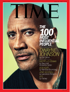
Magazine Cover #9
The target audience of this magazine appears to be for more professional/educational people. Techniques such as superimposition appearing within the coverlines create a more sophisticated and appropriate cover. The grouping of the coverlines to the right of the pictures make the magazine cover appear cleaner and simpler.. The image appeals to the target audience because it is only a close-up shot. Restricting the view of the model’s outfit and body forces the audience to pay attention to their facial expressions. In this case, Dwayne Johnson’s seriousness serves the purpose of this belonging to a target audience of professional/educational people. Ultimately, the coverlines are arranged with proper alignment, specifically left alignment.
The similarities and differences identified amongst the different magazine covers reveal that the media industry follows a similar template when designing, developing, and constructing a cover. Despite all 10 magazine covers displaying and serving varying purposes, the techniques utilized to achieve the cover page are surprisingly similar. Superimposition is the process of positioning/placing pieces of text or images below or above one another. Although it establishes depth and level within the cover, superimposition also serves the purpose of isolating the image from the text. For example, placing the masthead under the image could signify that the company is confident that their magazine is recognizable enough to purchase. Doing so, the text won't disturb the image, thus making it the focal point to its audience. Additionally, placing the coverlines over the image would gain it more attention from the consumer. Diligently and deliberately placing pieces of text could decrease the risk of your magazine cover appearing chaotic. In fact, these choices make your cover look organized and simple. It is crucial that when producing a magazine cover, the creator only utilizes images and text that are coherent with each other.
Influences on Magazine Task:
Performing this audit gained me new knowledge and information that I could take into account when prototyping my magazine task. I realized the importance of coverlines, mastheads, unique selling points, anchorage text, and superimposition. Now that I have received knowledge on these elements/techniques, I understand how to incorporate them into not only my cover, but the whole magazine spread.


Comments
Post a Comment